Employee Engagement Dashboard Template
Free employee engagement dashboard template (Excel) with built-in eNPS, engagement-score, and participation formulas. HRIS-ready with industry benchmarks for HR teams.
What Is an Employee Engagement Dashboard Template?
An employee engagement dashboard template is a pre-built Excel framework that HR teams use to track engagement scores, eNPS, participation rates, and recognition activity in one place — without rebuilding charts or formulas every cycle.
Disengagement is expensive. Gallup estimates global lost productivity from disengaged employees at $8.8 trillion per year — roughly 9% of global GDP. A single dashboard that surfaces engagement signals before they show up as turnover is one of the highest-leverage tools an HR team can run.
This template ships with four pre-built formulas (engagement score, participation rate, eNPS, recognition rate), a department-level analytics tab, and an HRIS-ready data structure. Pair it with structured workflows from the Recognition Templates hub.
How to Use This Employee Engagement Dashboard Template?
A four-step setup that takes the dashboard from blank Excel sheet to a leadership-ready monthly report.
Step 1
Step 1: Define the Metrics That Matter
Pick the four numbers leadership will actually look at: engagement score, participation rate, eNPS, and recognition rate. Adding more dilutes attention; cutting any of these leaves a blind spot.
Layer in retention rate and tenure-cohort engagement once the dashboard is established. Both are richer when you have 60+ days of trend data.
Step 2
Step 2: Connect Your Data Sources
Pull HRIS data from Workday, BambooHR, ADP, or SAP SuccessFactors. Engagement and pulse-survey data come from Vantage Pulse, Culture Amp, Lattice, or your in-house survey. Recognition data flows in from your recognition platform.
Reconcile two systems before reporting: HRIS and payroll counts often disagree by 1–3% because of contractor reclassifications. Document the source of truth in the dashboard footer.
Step 3
Step 3: Build the Visual Layout
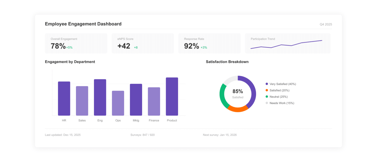
The template ships with KPI cards across the top, a 30/60/90-day trend line for engagement, a department comparison bar chart, and a participation heatmap. The layout is designed to read in under 60 seconds.
A good engagement dashboard answers three questions on one screen: how are we doing, where is it changing, and what is driving the change.
Step 4
Step 4: Analyze Trends and Recommend Action
Layer department, manager, and tenure dimensions on the headline numbers. Most engagement issues concentrate in two or three predictable pockets: a single team, a single manager, or new-hire cohorts.
Close every monthly report with two or three named interventions tied to specific findings. Reports without recommendations rarely move budget or headcount.
The 4 Engagement Formulas Built Into This Template
Every engagement dashboard rests on the same four formulas. The template ships with these in pre-built Excel cells; the definitions below let you verify the math before publishing.
1. Engagement Score
Engagement Score = Average survey score across key engagement questions
Most platforms use a 5-point Likert scale. A healthy benchmark for knowledge-work organizations sits at 3.8–4.2 (out of 5), or roughly 70–80% favorable on a percentage scale.
2. Participation Rate
Participation Rate (%) = (Survey Participants ÷ Total Employees) × 100
Below 60% participation, headline scores become unreliable — non-responders skew toward disengaged. Most organizations target 75%+ participation on quarterly engagement surveys.
3. Employee Net Promoter Score (eNPS)
eNPS = % Promoters − % Detractors
Scored on "Would you recommend this company as a place to work?" (0–10). Promoters score 9–10, detractors 0–6. Bain & Company places healthy eNPS at +20 to +30; world-class above +50.
4. Recognition Rate
Recognition Rate = Total Recognitions ÷ Total Employees
Healthy programs see 1–4 recognitions per employee per month. Bersin / Deloitte links recognition-rich cultures to up to 31% lower voluntary turnover.
Engagement Benchmarks: What Does Healthy Look Like?
Headline scores without context produce alarmist or complacent reports. Use these published benchmarks alongside your numbers.
| Metric | Healthy Range | Source |
|---|---|---|
| Engagement score (5-point scale) | 3.8–4.2 / 5 | Gallup Q12 norms |
| Engagement (% favorable) | 70–80% | Culture Amp Workplace Insights |
| Survey participation rate | 75%+ | SHRM Survey Research |
| eNPS — healthy | +20 to +30 | Bain & Company NPS Research |
| eNPS — world-class | +50 and above | Bain & Company NPS Research |
| Recognition frequency (per employee per month) | 1–4 | Vantage Circle platform data |
Use these as orientation, not targets. Industry, geography, and company stage all shift the healthy band. The right comparison is your own trailing 12 months alongside an industry peer set.
What Makes an Effective Employee Engagement Dashboard?
Six characteristics separate dashboards that drive decisions from dashboards leadership ignores after the second cycle.
1. Reads in 60 seconds
Top KPI cards, one trend chart, one comparison view. Dashboards that need a guided tour rarely get used in board reviews.
2. Reproducible methodology
Same formulas, same data sources, same period boundaries every cycle. A dashboard whose definitions move quarter to quarter loses credibility instantly.
3. Segmented by department, tenure, and manager
Headline numbers rarely move action. Department, tenure-cohort, and manager-level cuts surface the real work to do — and the people accountable for it.
4. Benchmarked against industry data
Cite Gallup, Culture Amp, Bain, or SHRM benchmarks alongside internal numbers. An engagement score of 3.8 sounds different next to a benchmark of 3.5 than next to 4.1.
5. Closes with named interventions
Two or three specific actions tied to findings. "Run stay interviews in Customer Success" is actionable; "Improve culture" is not. The dashboard's job is to make the next decision easier.
6. Easy to refresh
Dropping new data into the source tab regenerates every chart. The Excel template uses formula-linked cells so monthly refresh takes minutes, not hours.
Sample Employee Engagement Dashboard Templates
Two ready-to-use dashboard frameworks. Each shows the structure, formulas, and insights extracted to drive decisions across HR and leadership.
Sample Template 1: Real-Time Engagement KPI Dashboard
Best for: weekly engagement health monitoring by HR and leadership.
Dashboard Structure:
- Top KPI bar (engagement score, participation %, eNPS, turnover %)
- Trend line: engagement score over last 30/60/90 days
- Recognition activity widget (recognitions per employee)
- Pulse survey snapshot (favorable vs unfavorable)
Key Metrics & Formulas:
- Engagement Score = avg. survey score across key questions
- Participation Rate = (participants ÷ total employees) × 100
- eNPS = % promoters − % detractors
- Recognition Rate = total recognitions ÷ total employees
What Insights You Get:
- Immediate drop or spike in engagement levels
- Low participation flagging disengagement risk
- Correlation between recognition and engagement
- Early warning signals before attrition rises
Sample Template 2: Department-Wise Engagement Analytics Dashboard
Best for: identifying low-engagement teams and planning targeted interventions.
Dashboard Structure:
- Department-wise engagement score comparison (bar chart)
- Heatmap showing participation across teams
- Trend chart for engagement by department
- Retention vs engagement scatter plot
Key Metrics & Breakdown:
- Engagement score by department
- Participation rate by team
- Attrition rate vs engagement comparison
- Tenure-based engagement (new vs experienced employees)
What Insights You Get:
- Teams with consistently low engagement scores
- Managers or departments driving high engagement
- Engagement gaps across locations or roles
- Direct link between low engagement and high attrition
Explore Employee Recognition & Engagement Templates
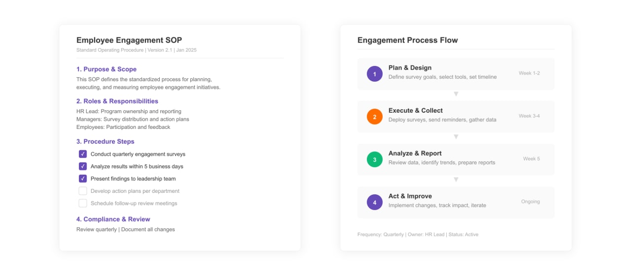
Employee Engagement SOP Template
Standardize your employee engagement processes with a clear SOP framework.
View Template ›
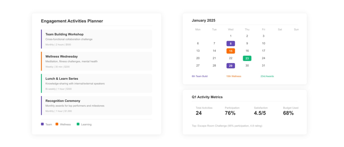
Employee Engagement Activities Template
Plan engagement activities that close the risk pockets your dashboard surfaces.
View Template ›
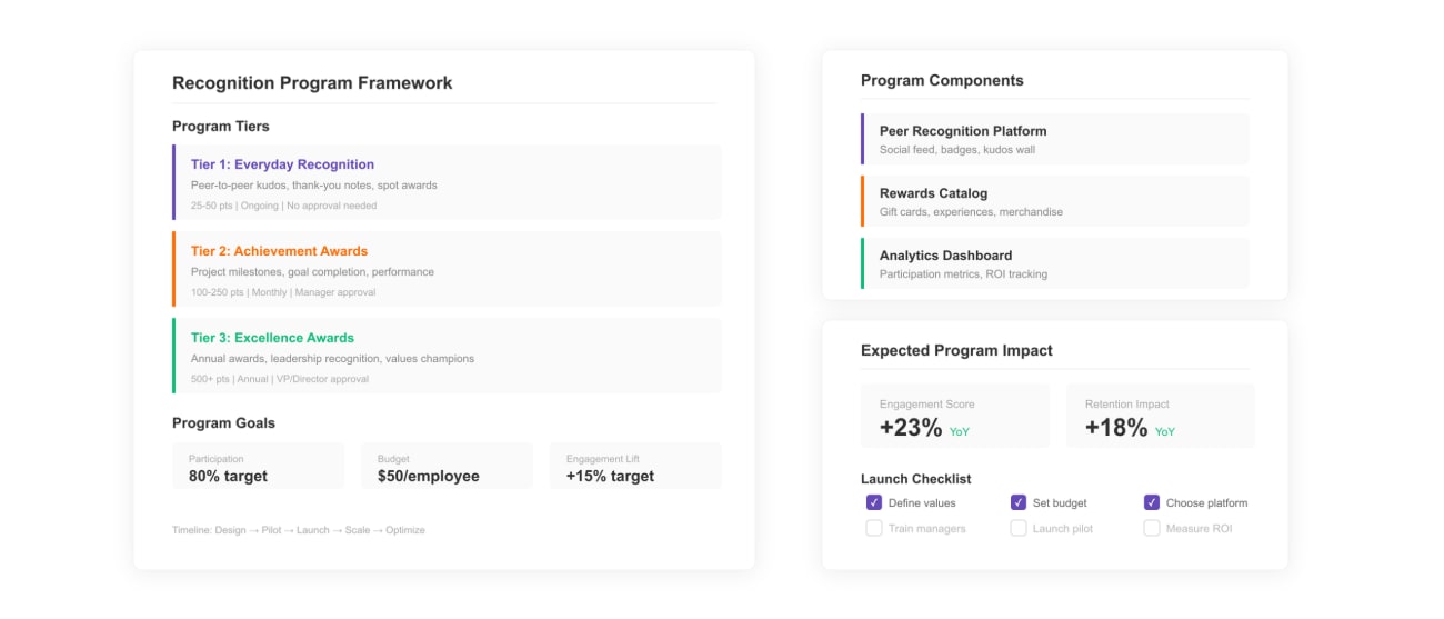
Employee Recognition Program Template
Build the structured recognition cadence linked to lower voluntary turnover.
View Template ›
Frequently Asked Questions
Want to See How Vantage Circle Powers Recognition?
Explore the Platform